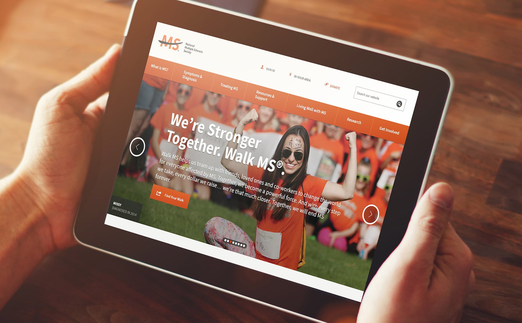
These days, your non profit’s website is just as important as its physical location. You probably meet more potential donors and other acquaintances through digital means than when they walk through your front doors. And just as you wouldn’t want to decorate your lobby in outdated furnishings or design your office with an inefficient layout, you don’t want to send the wrong message with your non profit website’s design.
If you’re interested in sprucing up your site, check out these four simple but strategic solutions.
1. Supercharge Your Page Loading Speed
Like cars on a racetrack, fast websites are effective websites. According to Moz, fast websites perform better in the SERPs (search engine results pages) and have a positive impact on conversions — both of which are essential to running an efficient nonprofit. The last thing you want is for potential donors to click away because they’re tired of waiting for the home page to materialize.
Fortunately, boosting page load time isn’t as difficult as it sounds, but you might need a professional to help you hit the right balance of page content and load speed. For instance, a graphics-heavy website might load slower than a more minimalist one, and a website with an inefficient back end will have to load too much code to appear swiftly. Making small or sweeping changes can make your site faster and more productive.
2. Strip Down Your Design
Just as modern architecture employs clean lines, lots of white space, and sharp angles, minimalist web design adopts a clean and simple strategy that removes all the extras and puts your content at the forefront. Think of this aesthetic as the Frank Gehry of website design.
The advantage of a minimalist approach is the chance to remove unnecessary distraction. According to Design Shack, minimalism has become a coveted form of web design because it’s clean, unassuming, and content-focused. Even if you don’t go for the full-on minimalist approach, you can remove unnecessary elements from each page of your site to make the content more compelling.
3. Let People Know What You Do
If potential donors don’t understand your purpose and mission within seconds of visiting your website, it’s time to make a few changes. Your imagery and brand message should make it clear why your non profit exists and what it hopes to accomplish.
This could be as simple as changing your heading text or adding more relevant photographs to your home page. Focus on building your brand through design so prospects don’t wonder if you’re raising money for a good cause or trying to sell hamburgers.
4. Add Calls-to-Action
A call-to-action (CTA) tells your prospects what you want them to do next. This is crucial for your non profit website’s design because you’re asking for donations, volunteers, or other help. If you don’t ask, prospects won’t know how to proceed.
Make sure every page of your website has a CTA. Give them more emphasis in the content (such as by using a big button or a different font). You’ll thank yourself when people start engaging with your non profit’s site instead of just looking at it.
Your non profit website’s design is critical for fulfilling your mission. Use the tips above to give your website a better chance of converting prospects.


