Editor’s note: This post is the first installment of our new series where we explore the different types of work and the different ways of working that happen at Electric Kite – and it may be similar to where you are, too.
Our senior graphic designer, Heather Oesterling, talks us through her process and inspirations, and sheds a little light into life as one of the creative brains at Electric Kite.
Q: What is one new thing – a tool, platform, industry trend, etc. – that you are excited about or having fun with? It can be something you’ve used or something you want to use.
A: Lately, I’ve taken interest in 3D design | modeling software (Cinema 4D & Blender for example) and creating complex and dynamic work in an environment I’m not typically used to. I dabbled in this a little over two years ago when using the Snapchat lens studio, and since then, my curiosity has continually grown. As of late, 3D design has come to replace the reliable, flat graphics and visuals we’ve come to expect–for example: https://pitch.com/ uses 3d modeled arms to detail the workings of their “product”. It’s not to say that these 3D renderings are any more effective than visuals that may have graced this web page previously, but “different” is sure to get and hold your attention.
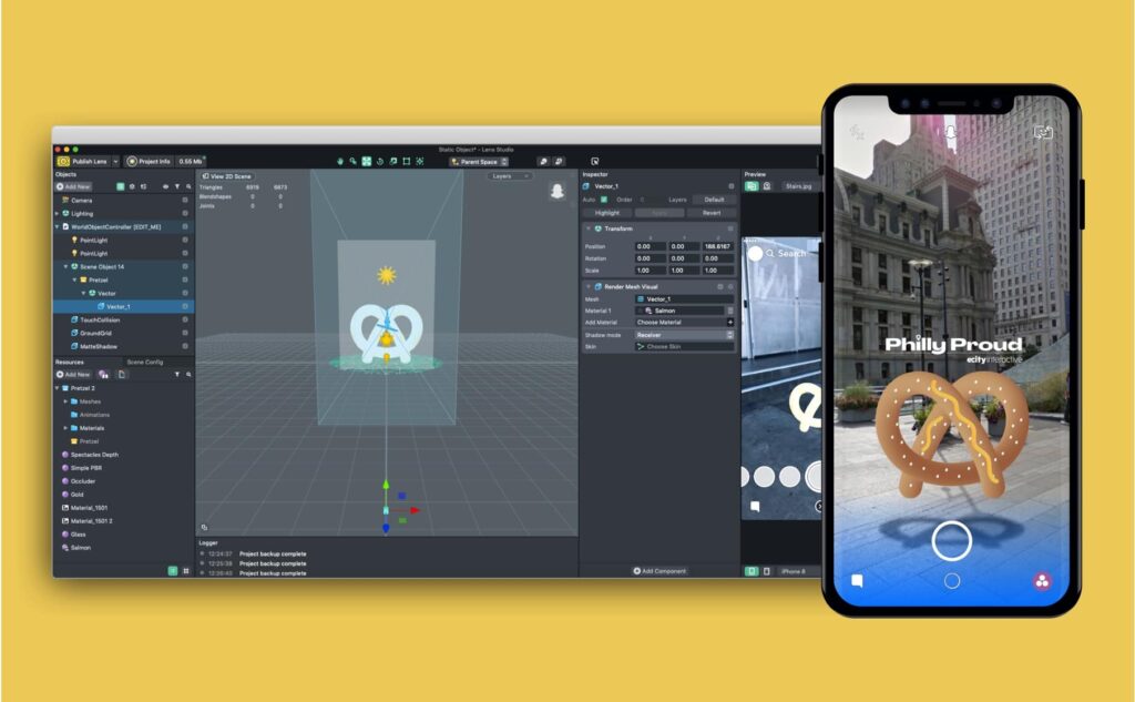
Ex: Who doesn’t love a good Philly Pretzel?
Snapchat Lens Studio allows you to import your own artwork or create from-scratch within their platform. You can then push the lens you created live via a Snapcode to share with a larger audience.
Q: We do a lot of – but not only – higher-ed work at Electric Kite. What design challenges do in higher-ed projects pose that are different from other types of design? What opportunities?
A: In terms of design, there may not be as many differences in regards to visual design as one might assume. It’s more so that I am designing for a very dynamic and wide-ranging audience (students, parents, faculty, deans, donors, alumni, etc.), which, naturally, can pose its own challenges because messaging, visuals, and approach all need to be customized to the end-user.
What I find interesting about higher ed is that, generally, each institution shares similar goals – increasing enrollment, retention or graduation rates, etc. – yet, each has a student, faculty, staff and alumni body that is specifically unique to them.
This means that the work you create in order to achieve the goals for one (institution) might not work for another–so the creative process, experience and execution varies even though the clients are all operating within the same industry.
I am a huge believer in education and its role in the development of ideas and forward progression of society as a whole. For me, personally, the fact that I get to play even a small part in a student journey – no matter what age – and their growth into a field they are passionate about is the greatest opportunity–and I’ve been fortunate enough to be able to do that both behind a screen as a designer as well as an educator!
(This goes for being part of any client story in general!)
I taught Visual Communications during the Fall 2019 semester at Millersville University of Pennsylvania (My Alma Mater) with a relatively “small” class of 10 students. The course focused on teaching students how to utilize visuals, like logo marks to convey messaging, ideas and content by way of the application of design principles . It was not only a learning experience for my students, but for me as well, requiring me to condense and present experience gathered over the course of years in my field of work and make it digestible for individuals that are laying the foundation for their own design careers.
Q: How do you go about immersing yourself in each client’s brand/product/service?
A: I typically dive into any client-provided immersion materials or turn to existing collateral, website(s) and digital presence. I like to get a sense of the existing visual and strategic direction so I can better design for where it needs to be going in order to help bring the client’s goals to fruition.
Q: How do you separate or blend your style and aesthetic from or with a client’s?
A: I feel as though my “style” is fairly fluid and adaptive. I enjoy taking new approaches to the work I do based on what is current and responsible in the “world of design.” If anything, I just try to blend the clients wants and needs with design trends and standards that fit the landscape.
Q: How do you manage workloads for multiple clients at once? And how do you adjust your mind’s eye when you move from one client style to another?
A: I usually start my morning off with some type of tentative list (and a lot of coffee!).
I need a visual of what needs to be addressed throughout the day in order to stay on schedule. Project management tools like Monday, Trello, Active Collab, Asana etc. are all quite helpful when it comes to this! (We use Monday at Electric Kite)
When moving from one client to another I try to briefly detach from design almost entirely to avoid creative fatigue. I will read an article or two on Medium to engage both sides of my brain, and then dive into the next project with a refreshed frame of mind.
Q: Why did you become a graphic designer?
A: I have always been (and still am to some degree) a fine artist. My senior year of high school, I extended myself beyond the realm of traditional mediums and enrolled in a graphic arts course.
After a few weeks of dabbling in Illustrator and InDesign it was as if I had that “ah-ha” moment – I knew immediately what career path I would pursue.
Being able to tell stories through art always drew me to the creative industry, and being able to do so for clients with a varying array of needs and goals is ultimately why I am in this field of work.
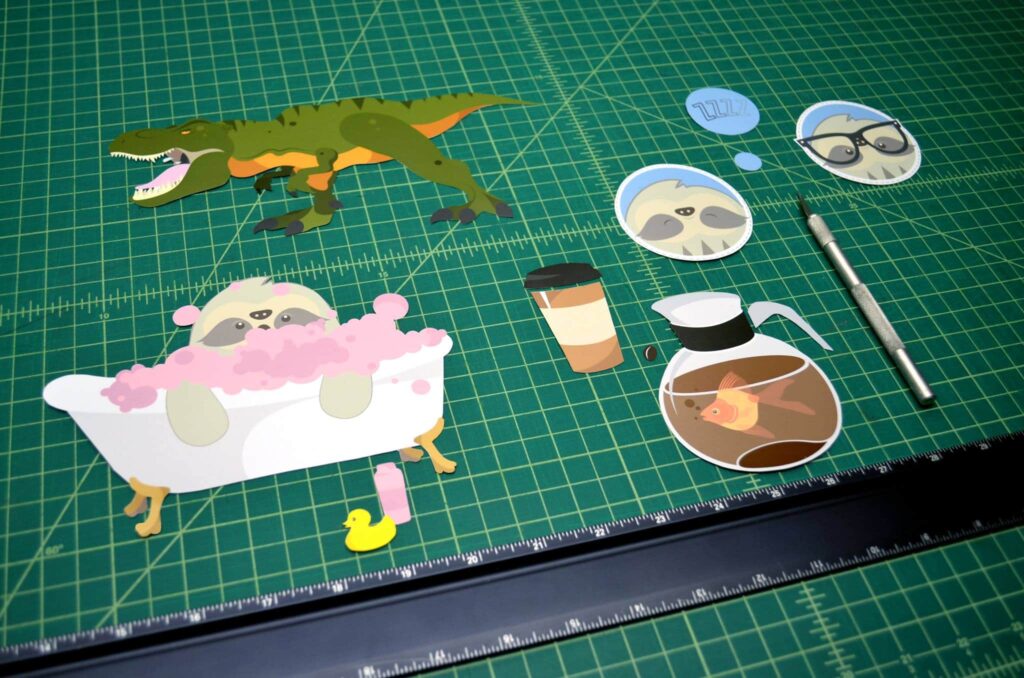
*Earlier Illustration work circa 2012-2013
Q: What is something you’re working on for a (anonymous) client that you’re excited about that you can tell us a little bit about right now?
A: I’m currently developing a social media style guide that will speak to the digital presence of a “mystery” client. It’s a little different compared to the typical style guides I would develop, which tend to focus primarily on visuals, whereas this documentation includes content strategy and the insight from other members of the Electric Kite team–an all around collaborative effort!
Q: What are you reading or watching right now that you’ve really enjoyed and/or found creatively inspiring?
A: I’ve been watching “Abstract: The Art of Design” series on Netflix which takes a look at the application of creativity across a multitude of fields. Naturally, the episode featuring Paula Scher was my favorite, and serves as a reminder that design has had a lot of growth in the past few decades.

