
R.I.P.
It’s time to bury the data report that, quite likely, is already buried in your inbox and was never opened — and so was never very much alive anyway.
Now, spoiler alert: I’m not saying ‘death to all dashboards.’ Instead, I’m saying that it’s time to stop creating data-dump reports and real-time dashboards that show lots of stats and charts and are very thorough and comprehensive, except for one tiny detail: All that data gets served up, with no context, making it meaningless.
Instead, to make data reports that are truly useful — truly alive — they have to be aligned with your OKRs (Objectives, Key Results) with KPIs (Key Performance Indicators) in that they help answer business questions and show how you are (or are not) tracking on the road to, you know, your business’s strategic objectives.

It’s time to make something better. Something actually actionable. Something you’ll actually discuss together with your team to make decisions, a dashboard that you’ll actually bookmark and come back to on the regular.
Making a KPI-Based Measurement Plan
The good thing about data is there’s so much of it, at least in digital marketing. The challenge that comes with all that data is the trap of data overwhelm. That’s why you need a handful of clear success metrics against which you measure all of that data, and isolate the stories.
Before you launch anything into the market, you have to create a measurement plan. You have to establish your KPIs to support the OKRs.
Read: 8 Keys to a Digital Marketing Makeover
To ensure my KPIs will be impactful, I like to start them at a higher level than the pure metrics, and instead think of them as questions I would need answered to know if my business is succeeding in meeting the Objective/Results. For example:
Objective: Increase product awareness in 2024
Key Result: Increase conversion rates by 3%
While the key result itself here is also a KPI (yes, that can happen), a few contributory KPIs will help our understanding of and guide where our efforts would be best served to influence the metric. Now, those core success metrics should be fairly obvious, and ideally they are documented. If they are not, then you can start by writing down as many KPI questions as you can think of, and make sure the team is involved.
- Is our content ranking high enough in organic search to reach users?
- Are our ads appearing in search to also cover our bases once people are looking?
- Do we have compelling ad copy and placements that drive people to go to our website?
- Are there any snags in the process preventing them from making a purchase?
- Does the day of the week influence conversion rate?
Then, qualify these questions based on their potential impact (are they actionable and core to your OKRs, or merely interesting?) and for priority (typically a mixture of effort and impact).
Read: So you’re thinking of hiring a digital marketing agency
This is where your context comes into play: Maybe your type of business IS heavily impacted by the day of the week, therefore you should monitor weekday vs. weekend conversions in order to support your lower periods. But for most large organizations, this is really more interesting than a driving force, and time would be better spent refining the audience messaging.
Make it Visual
Ideally, we will want to focus on the most important OKR first, the big idea. Then, figure out what KPI metrics you would have to measure to get the most direct information needed about performance related to that primary OKR.
The challenge is to say more, with less. What three variables can you measure and impact to reach your goal? I like to think that three KPIs is the optimal amount to ensure you have focused measurements, and that any proposed tweaks don’t cascade their impact too broadly.
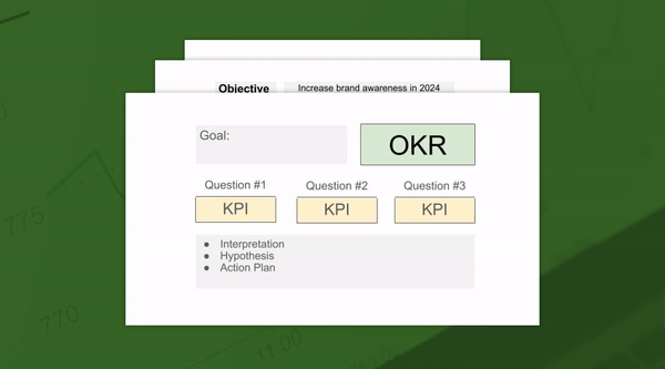
Make those KPI factors less important visually than the OKR, and lay them out to tell a short story. Making sure that translates is where the insights come in. Having an area where you document what the data is saying, and what will happen next is critical for a mutual understanding, and making sure the interpretation travels accurately.
How to Build That Better Dashboard
In the good old days, you could have pulled all of this data cleanly and clearly from Google Analytics — Google’s Universal Analytics platform, that is. But Google pulled the plug on UA and replaced it with Google Analytics 4 (GA4) in October, and getting that data is a bit of a challenge now. Without the ability to use cookies to track, we have lost continuity of attribution between channels.
Today, the best way to get this data is to pull from GA4, compare to your historical UA data (so you can understand the relative variance, and layer in other platforms, like Salesforce, Facebook, to compare how the different models (device-based and type) best match the actuals..
To aggregate data across ad platforms, we’d suggest utilizing a reporting platform. If your team has a clean CRM such as Hubspot or Salesforce that properly tags sources of traffic, this could be a great place to start. In situations where CRMs need a bit of cleaning up, we’d suggest using a reporting software that does not rely on continuous manual work (ex: Looker studio, Whatagraph, DashThis or Ninjacat).
Changing Course
The whole point of having KPIs is knowing when you’ve hit them — and when you are failing to do so. It’s the ability to enable informed decisions and provoke discussion. That means sometimes a KPI will no longer be needed — and that is not just okay, it’s a good thing, because it means you’ve succeeded.
And if you’ve succeeded in hitting that goal, now it’s time now to iterate and optimize. One of the best ways to handle true analytics is to have a testing series, and constantly make measured tweaks to adjust for evolving conditions.
Avoid Analysis Paralysis
By having a concise dashboard with clear interpretation, you’ll have data-driven alignment and reporting to tell you how effectively you are performing as an organization. And once you’ve done that, you can set down the shovel you’ve been using to dig through those heaps of analytics, open up that streamlined dashboard, and start making data-informed decisions, and stop than wallowing in the depths of meaningless numbers.
And then you can say farewell to those old reports.
Rest in peace.
Want to talk about what a clear and actionable data report could look like for you? Let’s chat.
- Originally Published: 10.30.23