Penn Campus Express

Welcoming New Students with a Tailored Digital Onboarding Experience
There’s a lot for new college students to accomplish before the start of classes. Between finding room assignments, selecting a dining plan, filling out health forms, and connecting with new roommates, it’s enough to overwhelm even the most organized of first-year students. And since many of these processes have independent timelines and deadlines, it can be quite a challenge for students to manage all of them.
Our Role
- User Experience
- Web Design
- Development
The Client
The University of Pennsylvania already had an online hub to give incoming students key information and a path to completing the tasks that would prepare them for an amazing first year.
But while the site functionality had continued to meet the needs of the university, eventually, the navigation and user interface needed to be modernized to better meet the needs of today’s students.
So we began working with Penn with the primary goal of updating Penn Campus Express to help students understand and prioritize the tasks they were required to do. Penn also wanted to encourage students to visit all sections of the site so they would be aware of the range of available options that would be helpful in the transition into college life. Finally, they wanted incoming students to feel welcomed into the Penn experience.
Since the site was used by graduate, undergraduate, and transfer students, it had to be dynamic enough to evolve to meet the individualized needs of students’ entry into Penn. But this hub had to be more than just functional and fluid—it also had to have an innovative design and engaging navigation that spoke to a student population with varying levels of familiarity with the college onboarding process.
Planting the Seeds
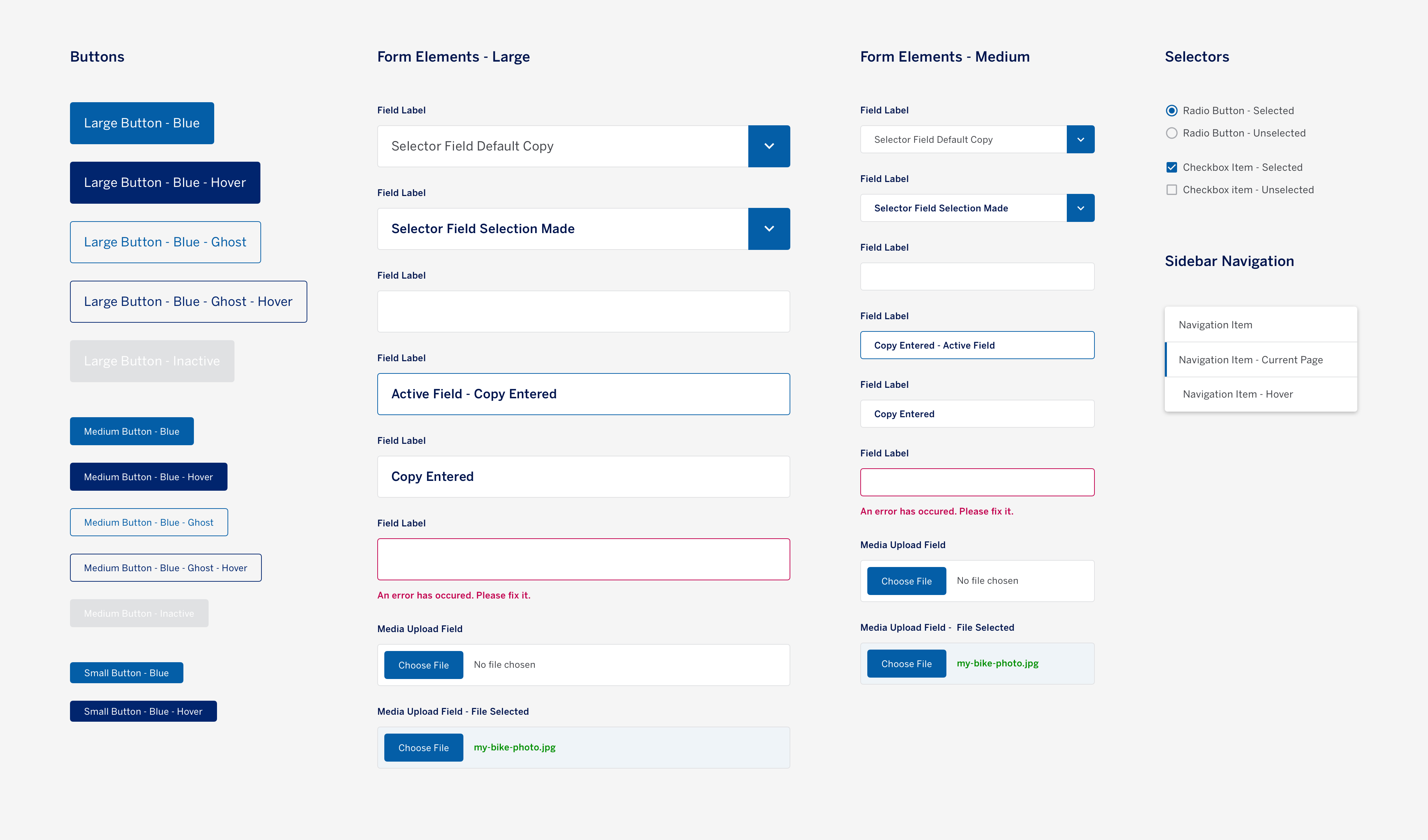
We got to work, reimagining this critical tool to encompass all of Penn’s current needs and to continue to meet those needs well into the future:
The site needed to be tailored specifically for Penn students.o naturally, our first step was user research. This included a thorough and detailed process:
- We conducted interviews and workshops with the team stakeholders to understand the site’s functional requirements.
- We thoroughly reviewed the previous site’s analytics to understand how students were using the existing resources available (and where they weren’t as engaged).
- We surveyed students who recently went through the onboarding process to understand their frustrations and goals.
- We interviewed those new students to understand the kinds of questions they had, identify which areas in the current onboarding experience confused them, and to determine where they looked for answers.
- Those findings drove our plan for the new site structure, which we validated with a tree test—an analysis of a website’s navigation structure and labeling.
The Results
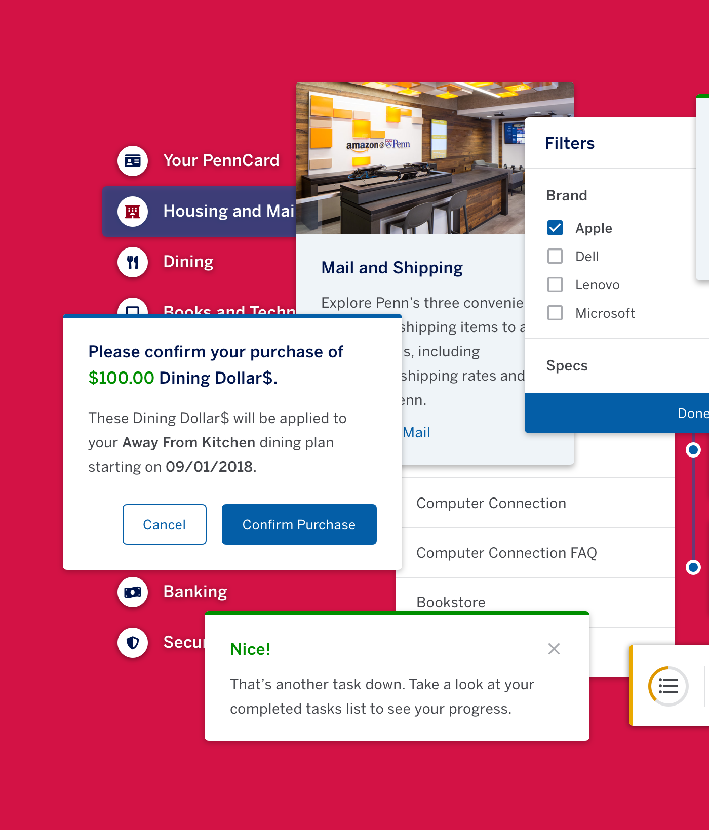
This data enabled us to optimize naming conventions and informed the hierarchy we built into the live website.
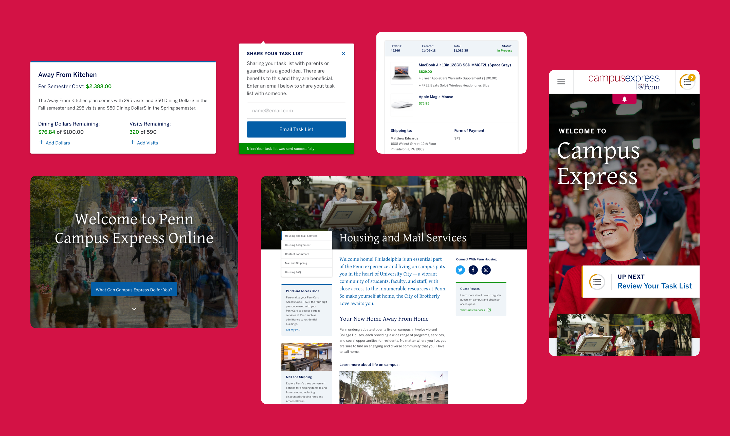
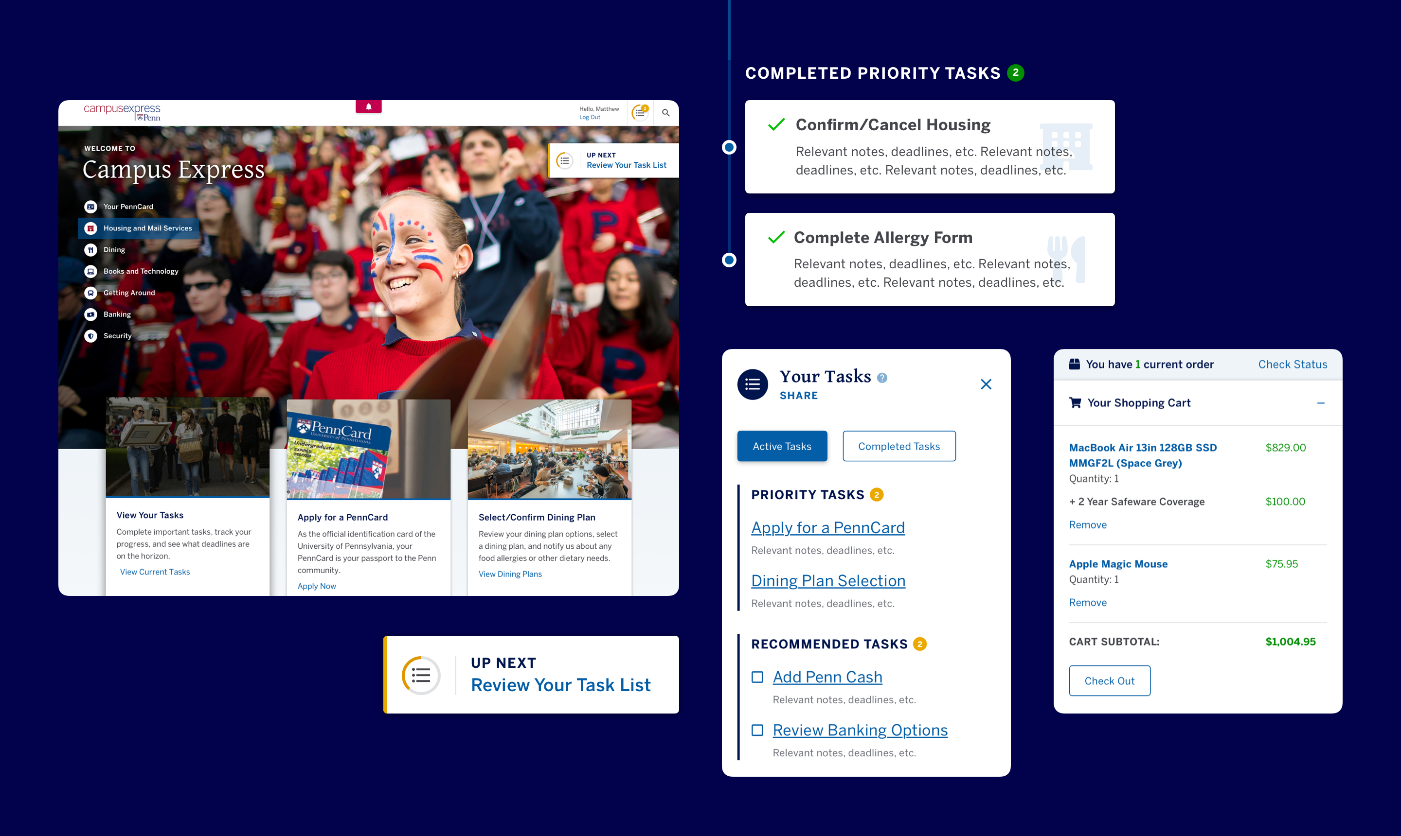
We streamlined the presentation of deadlines, tasks, and forms into a central portal that encourages students to complete them on time.
To help guide students, we created a dynamic task list with progress-tracking so students always know exactly what they need to do to be fully up and running—from finding their first-year residence to registering their property with campus security, it’s all right there, centralized, categorized, and guided. We even included a handy way for students to share their progress with parents who may want to ensure their kids are on top of their to-do list.
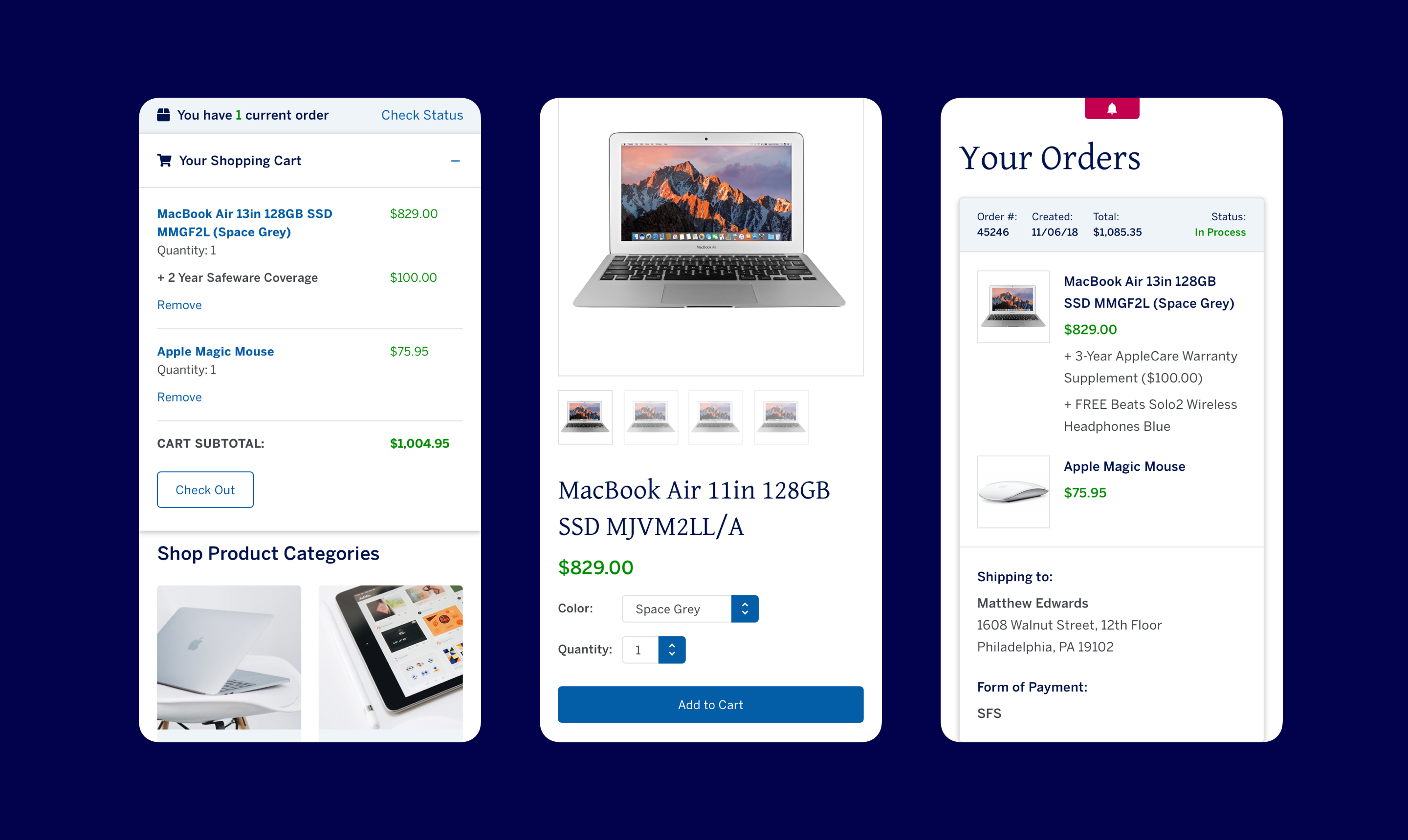
Ultimately, we created an engaging interface to help students more easily access what they needed and complete tasks independently, ensuring that by the time they arrived at Penn they could spend their time exploring campus and making friends. And, according to the Penn team, it’s been a huge success, with a significant increase in site usage and a decrease in student inquiries to various administration offices about onboarding tasks.
