Today’s students don’t interact with colleges and universities the same way they used to. They might still attend college tours and consult their high school guidance counselors, but they also do their own research. The first impression they get of your school might be through your school website design.
According to The Journal, eight out of every 10 high school students owns a smartphone. If you think that students will wait until they get home and turn on their desktop computers to look up your school, you’re missing out on a significant marketing opportunity.
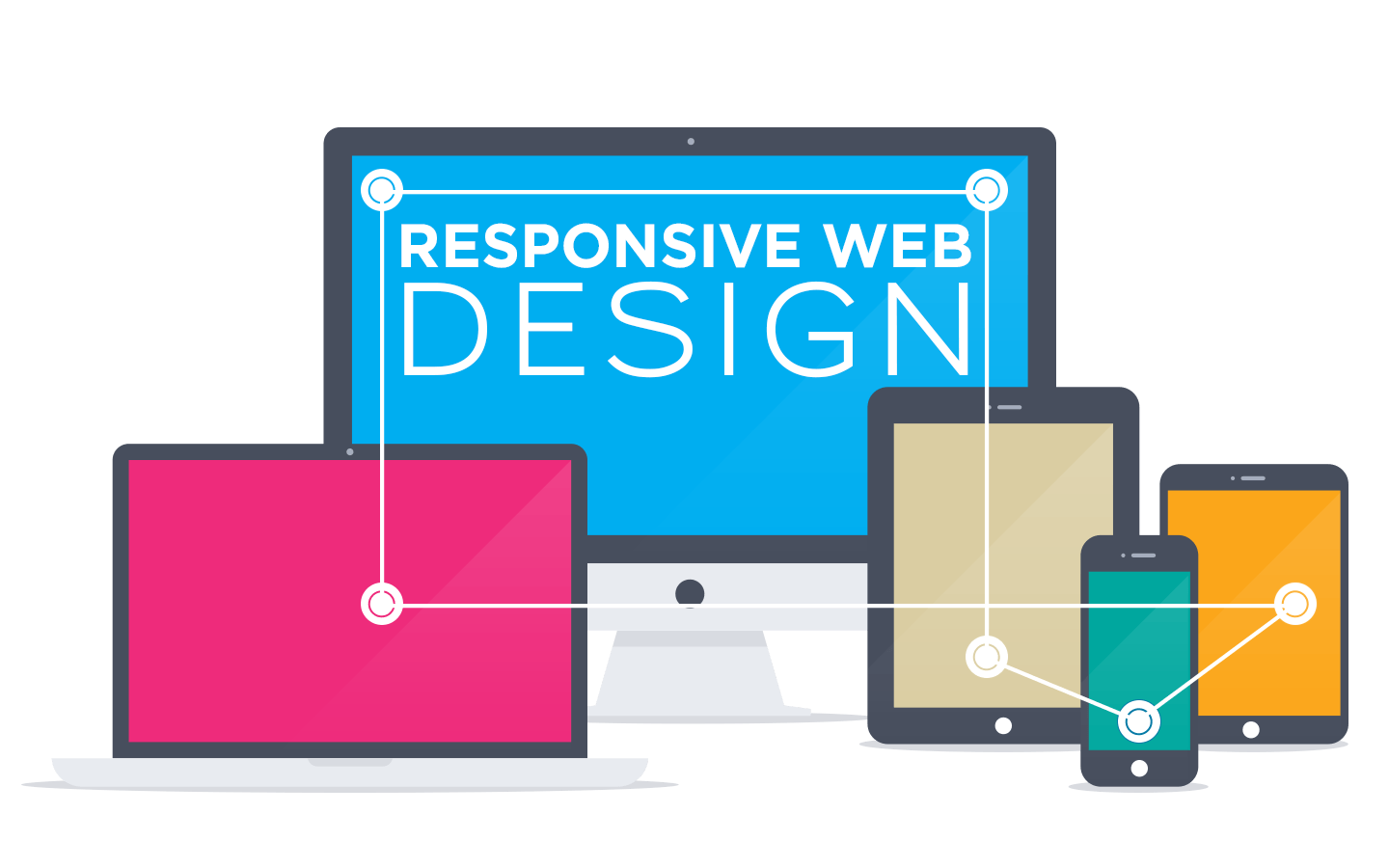
Show That You Understand Students’ Needs

If you adopt a mobile-first mindset, you’ll instantly communicate to teenagers and other prospective students that you value their opinions and want to meet their needs. They’ll see that your school’s website renders well on their smartphones and tablets, so they’ll feel comfortable interacting with your school.
However, if your website features tiny print and distorted images on their smaller screens, they probably won’t waste their time. They’ll wonder why you haven’t accepted technological advancements and made the effort to change with the times.
Create a Pleasant Experience
If you’ve ever tried to peruse a non-mobile website on a mobile device, you know that it’s an exercise in frustration. You’re constantly resizing the screen, scrolling horizontally to finish reading sentences, and fighting the urge to just play another level of Candy Crush.
Schools with a mobile-first mentality appeal to prospective students. Teens and young adults will have fun browsing your website and learning about your programs. Most importantly, they’ll stick around long enough for you to make a good first impression.
Improve Your Search-Engine Rankings
Google prefers responsive school web design. If you embrace mobile technology and design a mobile-friendly site, you stand a better chance of appearing at the top of Google’s search engine rankings. Otherwise, you risk slipping down the SERPs (search engine results pages) and into obscurity.
Prospective students might find you in other ways, such as through referrals from past graduates or because of family connections. However, you don’t want to leave this up to chance. Making every effort to rank highly in the search engines will make your school far more visible to potential students (as well as donors).
Faster Page Loads and Better User Experience
Responsive, mobile-friendly websites aren’t just an asset from a marketing perspective. They’re also lighter, leaner, and less voracious in terms of resources. Your responsive website will consume less bandwidth and put less stress on your servers.
Of course, this also ties into the user experience. Responsive sites have faster page-loading times, which means users access your content faster. This can make a big difference in the teen and young adult market. Young people have short attention spans, so don’t give them a reason to click (or tap) away.
- Originally Published: 02.18.16