As someone who is very familiar with the blood, sweat, and tears that go into designing and building a new website, I know how disappointing it can be to launch a beautiful new site and then not see the desired impact on your business. Your company’s website should be a significant channel for customer leads and business growth. But what stops some websites from being as effective as they should in converting visitors into actionable leads? Web designers can dramatically increase website conversion by understanding the psychology that underlies how people interact with websites and the context of their visits.
To better understand a user’s perception of your website, I’ve detailed a few key UX principles below that can greatly impact your ability to turn web visitors into leads and customers:
CALL-TO-ACTION PLACEMENT AND TREATMENT
One of a UX designer’s top priorities is to make it easier for users to accomplish their desired tasks. For most websites, this process typically starts with clicking on a call-to-action (CTA) button and filling out a series of web forms.
The placement and visual treatment of these buttons and forms can have a significant impact on a user’s propensity to click and complete the task. Key calls-to-action you wish to be easily selectable (such as your “Add to Cart”, “Free Trial”, or “Schedule Demo” button) should be large, visually distinct, and positioned close to where users will have their cursor positioned.
The size and placement of these calls-to-action should be carefully considered to make it as easy on the user as possible. In fact, psychologists have developed a model that can predict the amount of time a user will take to move to and select a target based on the size and distance of the object. This model (called Fitts’ Law after psychologist Paul Fitts) encourages designers to reduce the distance between steps in a sequence, make target objects large enough for users to see them immediately, and assist in the easy selection of interactive elements without sacrificing accuracy. For example, links, whether they are text or buttons, should allow users to click anywhere in the region rather than just on the href HTML link.
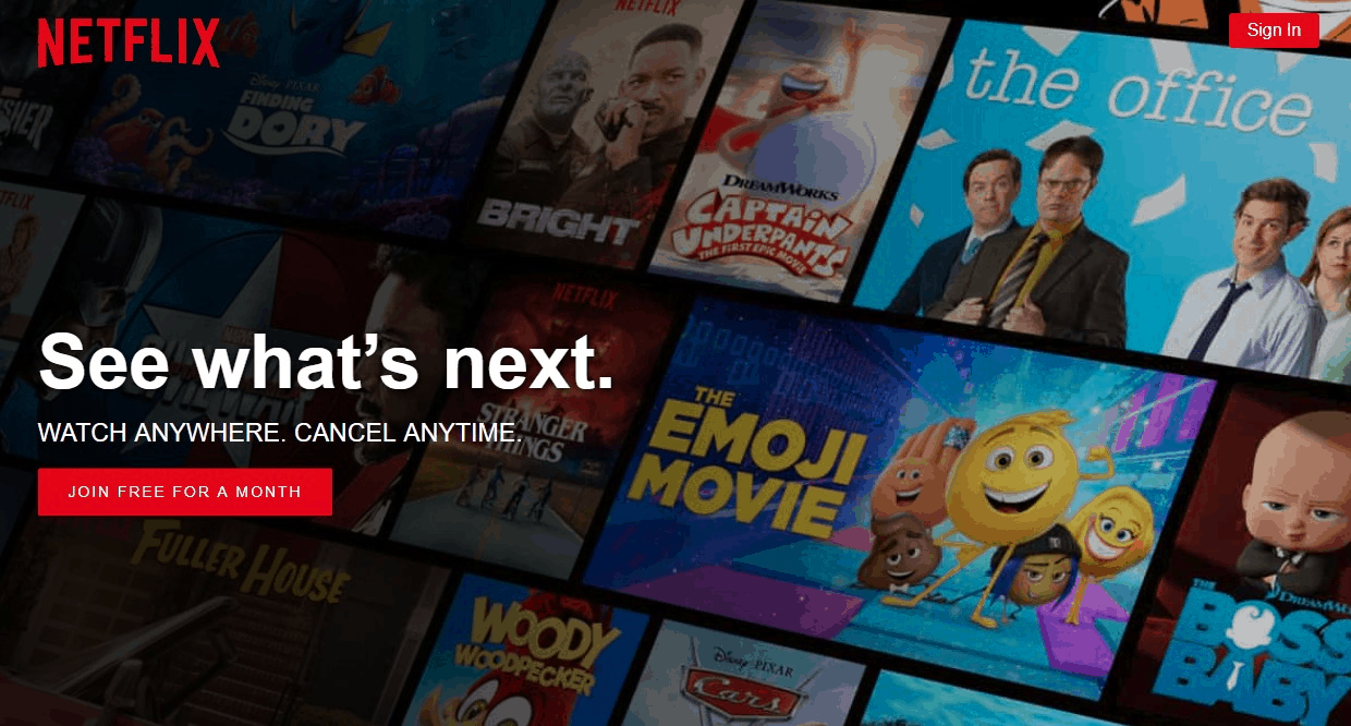
Netflix’s homepage is a great example of thoughtful button placement and treatment. The simple page draws the user’s eye towards the copy, and the “Join” CTA button is large enough to see immediately. The bright red color contrasts with the dark background, and it’s positioned toward the top-left of the page (where the user’s mouse is most likely to be).
SIMPLIFY CHOICES
Designers can increase the likelihood of users staying on their website and completing key tasks by simplifying the number and complexity of choices presented.
What’s wrong with offering choices, you may ask? The more choices that a person is given, the longer it takes and harder it is for a person to make a decision about how to proceed. Too many choices can create decision paralysis, causing frustration and increasing the likelihood that users will abandon your site altogether.
Related to the KISS (Keep It Simple, Stupid) principle, Hick’s Law states that the more choices a person is given, the longer that person will take to reach a decision. And the longer a person takes to reach a decision, the more likely it is that they’ll give up and never complete the task.
The most obvious and frequent implementation of this is in the number of items in a website’s navigation, lists, or interactive elements. However, simplicity can also benefit designers who want users to make a timely decision. This can be a great approach for enabling simple purchases, converting users into free trials, soliciting donations, and encouraging newsletter signups.
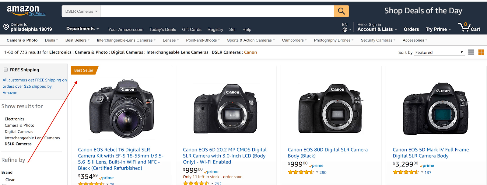
By simplifying the process and holding back options until necessary, you can take advantage of impulse decisions and avoid creating additional barriers for users. You see this in practice in features like Amazon’s “Buy now with 1-Click” button and Google’s famously simple homepage.

UNDERSTAND THE CONTEXT OF YOUR WEB VISITS
Despite web marketers’ best efforts, users spend the majority of their time on websites other than the one you are tasked with promoting. For large or complex purchases, users are likely looking at many of your competitors’ sites. Even in the best circumstances, any individual website will make up just a small percentage of your users’ online experiences.
While it may be fun for designers to flex their creative muscles and reinvent web experiences, users prefer your website to work the same way as all the other sites they already know and have grown accustomed to. This includes:
- Design
- Terminology and labeling
- Interactions and workflow
- Information architecture and navigation
This is the gist of Jakob’s Law, which leads designers to build for patterns to which users are already familiar. So when you are designing your website, make sure you are staying consistent with the norms of your industry. If you deviate too much, you risk confusing and alienating the very people you want to attract.
For instance, if you are shopping online for a pair of shoes, you have an expectation that the site you visit will be structured in a relatively consistent way from store to store, with the same information presented:
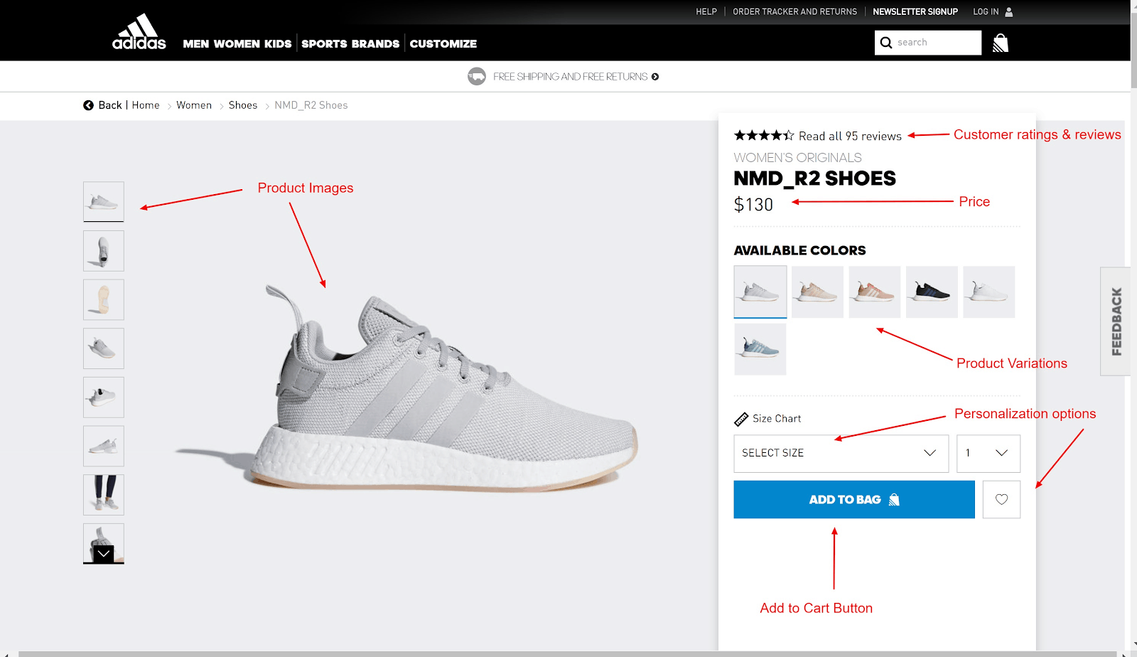
When was the last time you saw an Add to Cart button at the top of the page? Or the pricing info underneath the product images? You can imagine that a layout like that would cause a noticeable decrease in purchases. And why is that? Without even realizing it, you’ve been trained to look for these elements in particular places – just like Jakob said you would.
SERIAL POSITION EFFECT
Multiple studies have shown that when users are presented with a list of words or items, they tend to remember the first and last few words and are more likely to forget those in the middle of the list. This is known as the serial position effect. The propensity to recall words at the beginning of the list is called the primacy effect; the propensity to recall words at the end of the list is called the recency effect.
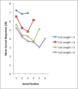
When creating your navigation, organizing your product listing layout, or detailing pricing tiers, savvy designers will place their top priority or most profitable option first on the list. The next highest priority should be the last item on the list. This may be why CrazyEgg displays its most expensive plan first on its pricing page:

MAKE DESIRED OUTCOMES VISUALLY DISTINCT
One way to counteract (or perhaps complement) the serial position effect described above is to make one of the options stand out by treating it visually different than the other options. You see this any time you go shopping online and see a product with a “Most Popular” or “Sale” tag to bring your attention to a particular item:
The Isolation Effect predicts that when multiple similar objects are present, the one that differs from the rest is most likely to be remembered and valued. Web designers can make a particular option seem more appealing when it is placed next to seemingly inferior alternatives. If you look back up at the Crazy Egg example we reviewed earlier, this is the approach they’ve taken for their second most-expensive option, the “Plus” tier. You’ll see that even though it is second on the list, your eye is naturally drawn there because of the blue treatment and outline around the plan description.
SHOW PROGRESS & GIVE CLOSURE
Why do the best TV shows always seem to end on a cliffhanger, leaving you wondering what will happen next? It turns out, this TV gimmick to get users to tune in the following week plays off of powerful psychological behaviors that cause people to better remember things that are unfinished or incomplete. Known as the Zeigarnik Effect, people’s minds keep going back to activities they perceive as being incomplete, working as a reminder to complete their goal.
So if an incomplete task creates a strong motivation to complete that action, designers can leverage that impulse to push users through multi-step processes by conveying to users that they are not done yet. This can be done effectively in an e-commerce buyflow, account registration, or reading an article. For example, Harvard Business Review article pages have an animating header that shows a user’s progress as they scroll through an article, subtly encouraging users to keep reading until they reach the end of the story.

Many donor forms adopt this structure as well, encouraging users to complete an easy three-step process to complete their donation:

Similarly, one should also consider how to best take advantage of a user’s mindset after just completing a task. If there are subsequent steps that make sense, they can be presented as a natural extension of the first process to increase the likelihood that the user will stay and remain engaged.
CONCLUSION
Put these design principles to use by taking a look at your current website design. Are you placing call-to-action buttons in relevant places where users expect them?
Do you have too many navigation links? Are your signup forms overly complex or cumbersome? Many of these problems are quickly and easily fixed with just a few tweaks.
Of course, if you would like one of our conversion strategists to talk through our observations, get in touch and we can schedule an audit and share our recommendations.
- Originally Published: 03.13.18