We’ve been developing websites since 1999, so we’ve seen a lot of web design trends come and go. The ones that mature from a fad to a popular best-practice are usually the ones that improve user experience while adhering to the principles of UX design.
That’s what each of the items on this list have in common—they are all design elements or development practices that center the user experience, whether that is the end user or the web manager.
1. Multi-sites for Higher Ed
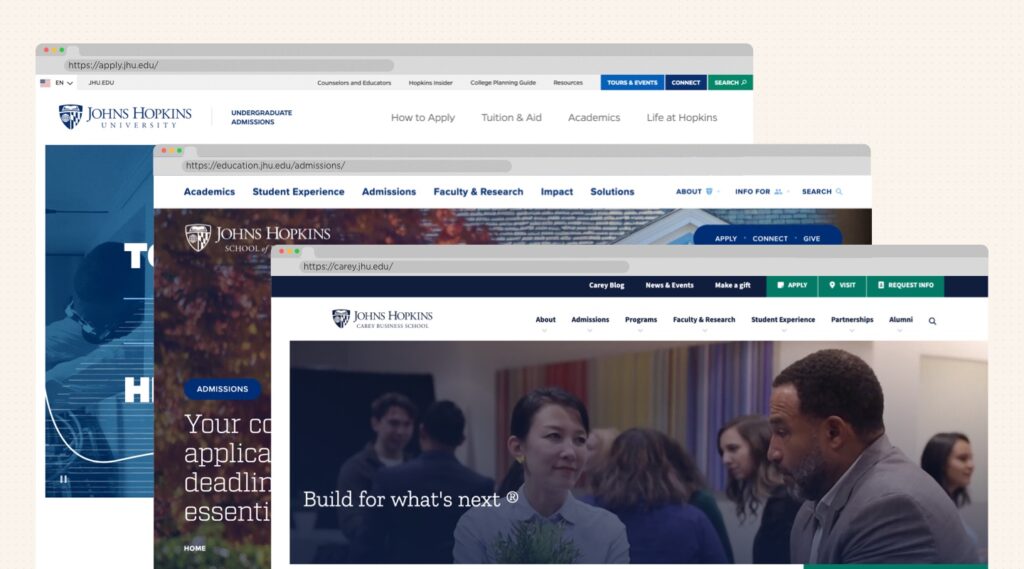
The majority of small and mid-size colleges house all of the information and content for their various users on a single site. That means everything from conduct policies, work order forms and alumni reunion information is swimming in the same ecosystem as admissions-enabling content for prospective students. Confusing for end users? You bet. A beast to maintain and govern for admins? Big time.
Larger universities solved this a long time ago by creating dedicated sites for admissions, alumni, their main .edu and so on. Such a multi-site architecture is a great solution for colleges and universities because it provides centralized control while allowing individual departments, schools, or programs to manage their own content. Not only does this make it much easier to enforce branding, security, and accessibility standards, but it also maintains a consistent user experience under a unified design system.
The biggest win is that institutions can spin up new sites for different departments, research centers, events, or initiatives without having to build from scratch. This allows them to maintain a nimble website ecosystem. And of course, the shared infrastructure reduces hosting and maintenance costs while allowing for centralized tracking and a holistic view of their traffic and users.
Not to mention that it makes it a better user experience for that potential incoming first-year student who wants to see all of the information that’s relevant to them and to be able to find it easily without falling down rabbit holes that have nothing to do with them.
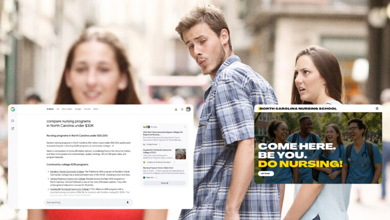
2. AI Search Functionality, Front and Center
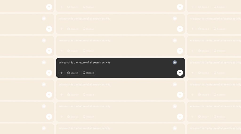
AI search is the future of all search activity. It will fundamentally change not just internet search (as SEO gives way to AEO), but the operating principles and purposes of websites. We need to start building for that future now.
How? By enabling AI-search experiences that let users who are looking for specific information—eg, high-intent users—find what they’re interested in right away without hunting through the navigation and sub-navigation elements, scanning FAQs, or relying on disappointing native search tools. You can do that right now by embedding AI search functionality prominently on your website (we’re building into the homepage hero for at least one of our current clients), letting those users who know what they want to find, find it. Those users who are still in the discovery phase will continue to use your website in a more traditional way, but to make sure you are engaging all of your users, you have to build for the AI-search future right now.
3. Micro-animations
True, these have been around for years, but usually on your more artsy or cutting-edge websites. Now is the time for them to go mainstream. Subtle animations and responsive design elements provide immediate feedback to users, making interfaces feel more intuitive and alive. These can include button animations, hover effects, or scroll-triggered animations that enhance user experience.
We love them because they’re FUN. They make a website a sticky playground and create a dialogue with the user. They’re memorable and encourage exploration.
But they also do really basic UX work like providing encouraging desired actions, reducing frustration, and improving accessibility. If they’re thoughtfully designed they can even strengthen your brand identity. Win, win, win!
4. Going Dark Mode
We still love a good dose of sunshine, but it’s heating up in the dark. Darker web designs and themes just make good, common sense. Sleek, dark sites can really emphasize the visual aspects of a site, making it feel even more like eye candy.
Considering that the internet’s peak hours are 4pm-10pm, some high contrast evening browsing can keep users on your site for much longer than a glaringly bright screen.
Dark themes are generally accepted to induce concentration and curiosity through a feeling of elegance and mystery, but it’s not right for every brand. Outcrowd writes, and we agree, that “A glow-in-the-dark object causes a surge of hormones, a heightened awareness, and a desire to examine it closer…Not every brand needs such a set of emotions. What is good for a gaming site won’t work for services associated with cleanliness or openness.”
Dark mode? Yes. But we still recommend you avoid the dark web…
5. Alternatives to Looping Video Heroes
We do a lot of work in higher education, where looping videos at the top of the homepage and other high-level pages is a near-ubiquitous practice. But we don’t have to tell you that whether it’s higher ed, B2B or even consumer sites, this is a very common trend.
And you can see why: If a picture conveys a thousand words, than a loop of beautiful, captivating videography can immediately impress countless notions upon a user. But like anything else, once it’s everywhere, it ceases to stand out. And frankly, we’re a little over it.
That’s why we’re increasingly considering and proposing alternatives: heroes with graphic-design elements, 3D-graphic design videos, even classic single-image heroes. Simply put, simplicity is in, and embracing this as we hit peak saturation of looping-video-heroes is a smart move.
The Core of Every Good Web Design?
Web design changes constantly, and what worked a few years ago quickly goes out of date. These are all trends we thin have staying power, primarily because they do what all good designs and functionality should do: put the user first and reduce friction.
Want to talk about improving your website functionality? Let’s chat.