Good digital experiences create trust and establish the foundation for lasting relationships that can lead to repeat visits and eventual leads and conversions.
The key to making that happen? Great UX. Fortunately, there are basic principles you can use to create the seamless, intuitive digital experiences you need.
These seven laws are fundamental to good UX design, and once you see them you’ll instantly understand them and can begin applying them to your own work.
Fitt’s Law | Hick’s Law | Jakob’s Law | Von Restorff Effect
Law of Proximity (Gestalt) | Miller’s Law | Zeigarnik Effect
1. Fitt’s Law
The time to acquire a target is a function of the distance to and size of the target.
How does this apply to digital design?
Make the most important targets large and visually prominent. This may seem obvious, but it’s a more common problem than you might think.
- Reduce the distance between steps in a sequence.
- Make target objects large enough for users to see them immediately and assist in the easy selection of interactive elements without sacrificing accuracy.
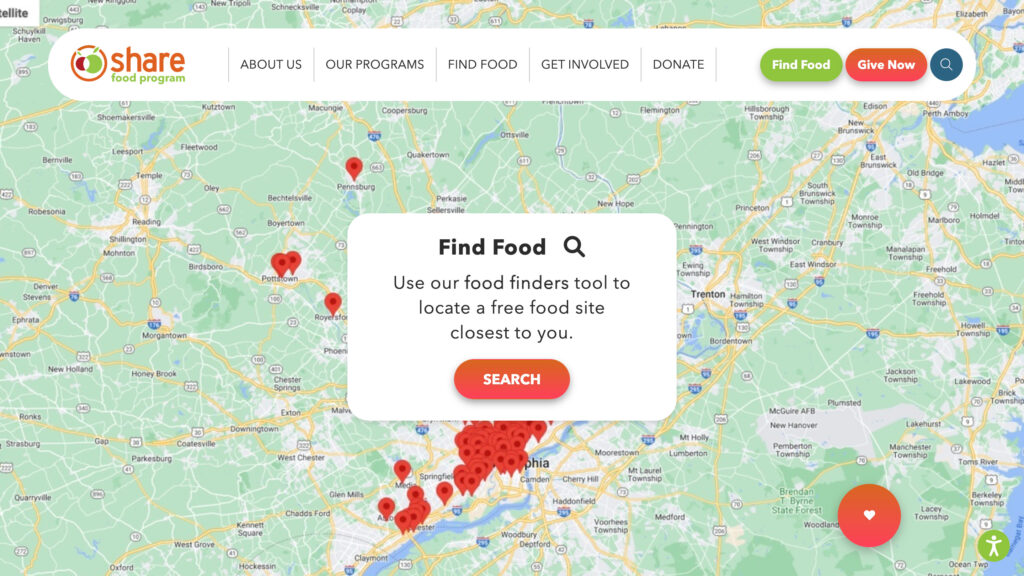
See Fitts’s Law in Action:

2. Hick’s Law
The time it takes to make a decision increases with the number and complexity of choices.
How does this apply to digital design?
- Keep the number of options small to make it easier for users to decide between them
- Break down complex problems into simple steps
- Don’t overwhelm users by highlighting too many options or features
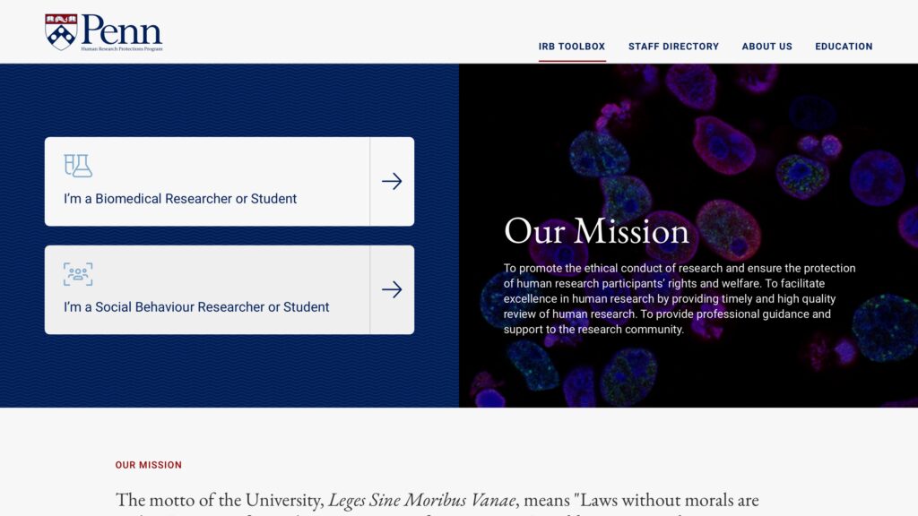
See Hick’s Law in Action:

3. Jakob’s Law
Users spend most of their time on other sites. They prefer your site to work the same way as the other sites they already know.
How does this apply to digital design?
- Don’t unnecessarily reinvent the wheel: Make sure you are staying consistent with the norms of your industry
- If you deviate too much, you risk confusing and alienating the very people you want to attract
- Reduce the time the user must spend to learn how to use your site by being consistent with accepted design standards
- Another tangible benefit of design for this law is that development time will be reduced
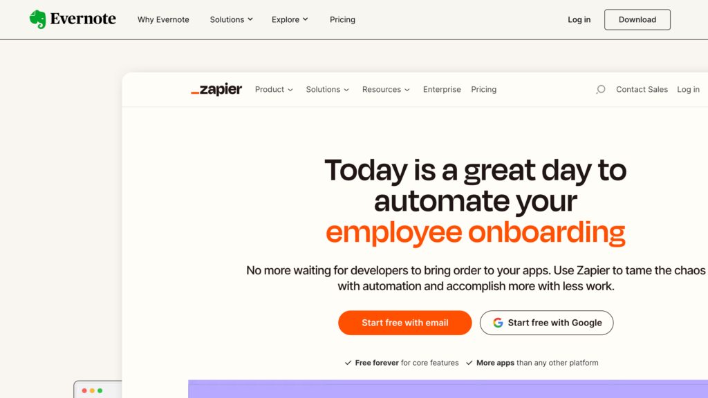
See Jakob’s Law in Action:

4. Von Restorff Effect
When multiple similar objects are present, the one that differs from the rest is most likely to be remembered and valued.
How does this apply to digital design?
- Make important information stand out by treating it as visually different from the other options.
- Web designers can make a particular option seem more appealing when it is placed next to seemingly inferior alternatives.
See the Von Restorff Effect in Action:


5. Law of Proximity (Gestalt)
Objects or shapes that are close to one another appear to form groups.
How does this apply to digital design?
- Group like items together and style them similarly. Doing so will immediately communicate that the items are related, making them easier to understand and take action on.
- Be wary of grouping unrelated items in this way as the user may assume a relationship between them that doesn’t exist
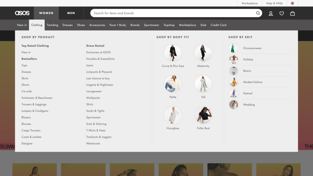
See the Law of Proximity in Action:

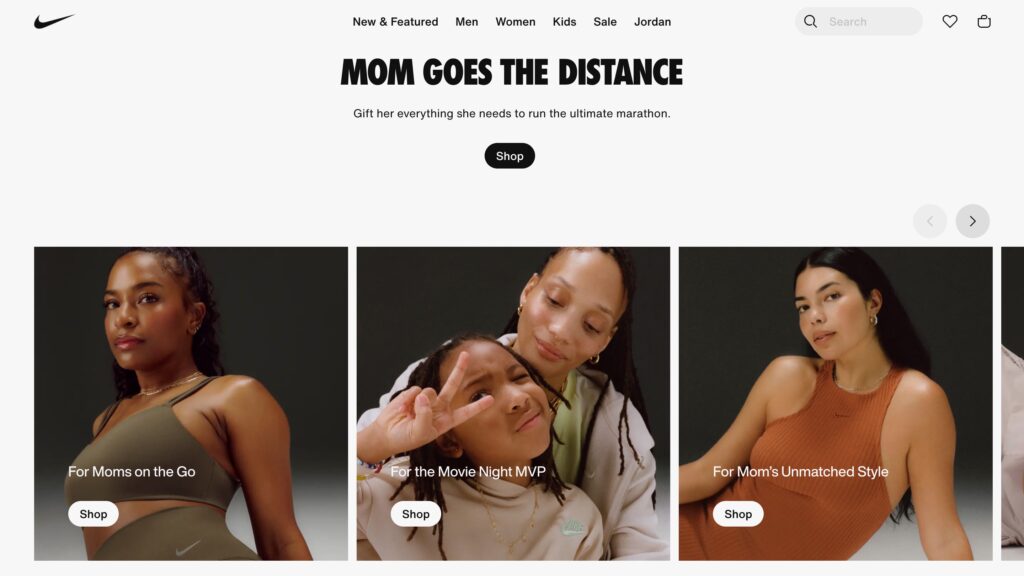
6. Miller’s Law
The average person can only keep 7 (+/- 2) items in their working memory.
How does this apply to digital design?
- Create content groups with 5-9 items of related information
- In navigation systems, avoid having more than 9 items, with 5-7 being optimal
See Miller’s Law in Action:
7. Zeigarnik Effect
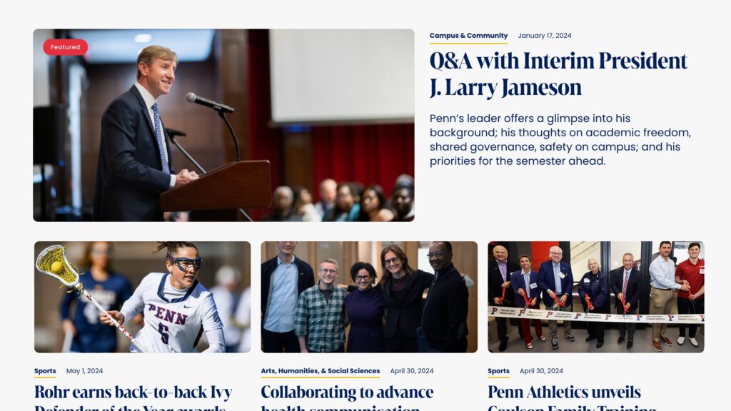
People remember uncompleted or interrupted tasks better than completed tasks.
How does this apply to digital design?
- People’s minds keep going back to tasks that are perceived as incomplete
- Displaying a task as incomplete creates a strong motivation to complete that action
- Designers can leverage that impulse to push users through multi-step processes by conveying to users that they are not done yet
- This can be done effectively by showing progress indication in multi-step tasks or by signaling incomplete items or notifications to stand out visually
- These applications are often used in e-commerce buyflow, account registrations, app notifications, or content consumption progress bars.
See the Zeigarnik Effect in Action:
